Here’s something that I wish more people involved in designing consumer software products realized — multiple choices in a product prevent the user from using the product and make him unhappy. Let me explain why.
The other day my wife managed to drag me to get a new pair of jeans. We went to a Levi’s store where they had choices differing in:
- Size
- Color
- Fit — slim, skinny, comfort, relaxed
- Cut — straight, taper
- Wash — stone, acid, something else I can’t recall
- Artificial creases / seams
- Torn / damaged material
After 30 minutes of trying, I figured out my type, but since I could not get the color I wanted (deep blue), I did not end up buying at all. This reminded me of Barry Schwartz’ Paradox of Choice (it’s a 2 min clip — go on):https://cdn.embedly.com/widgets/media.html?src=https%3A%2F%2Fwww.youtube.com%2Fembed%2F4matGzkYN0w%3Ffeature%3Doembed&url=http%3A%2F%2Fwww.youtube.com%2Fwatch%3Fv%3D4matGzkYN0w&image=https%3A%2F%2Fi.ytimg.com%2Fvi%2F4matGzkYN0w%2Fhqdefault.jpg&key=d04bfffea46d4aeda930ec88cc64b87c&type=text%2Fhtml&schema=youtube
As Schwartz said, he has written an entire book on the subject — it is a brilliant book and should be mandatory reading for anyone managing or designing a software product. Here’s a quick summary:
1) Too many choices cause decision paralysis
- Employee participation in 401(k) pension plan reduced as number of plan options were increased (2% drop for every extra plan option), thus losing out on the equal contribution their employer would have made (up to $ 5,000) — completely irrational behavior
- Multiple other case studies in different areas leading to the same conclusion
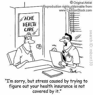
- Closer home in India, almost everyone from my generation has a LIC policy since that was the only choice for a long time, but how many of us have put off picking a SIP plan / mutual fund plan / health insurance plan just because the complexity of choices is so overwhelming?

2) Too many choices lead to bad decisions
- Even if you do manage to get out of paralysis and make a choice, you are likely going to make a bad choice
- People typically make a simpler choice, not the best choice — it is just too hard to make a good, informed choice
3) Too many choices cause anxiety
- Assuming you made a good choice, you would still not be happy
- During the decision making you will wonder if you are losing out on a better choice by making this choice
- Post-decision — in case your choice is not satisfactory in any respect, you will regret your decision — perhaps the other choice would have been better
4) Too many choices are good if:
- You know exactly what you want — then you can go and pattern match
- Choices are on the same dimension (only one variable is changing)
(BTW, the book has a lot more to offer than my little summary here, so don’t judge the book by my writing)
Implications for Product Design
The implications for product design are obvious. A typical consumer software product is a means to an end, and not the end in itself. The product should get out of the way to let the user accomplish his task. To a designer, each carefully thought thru feature of the product means a lot. A user couldn’t care less. He will start your app for a specific task, do the task and switch out. If we provide choices, we create cognitive load for the user, slowing him down. Worse, the user may not even understand the choices and end up making a bad decision.

A few years back, when my father was to be operated upon for a heart-valve replacement, the cardiac surgeon offered us a set of choices for the kind of valves that could be put in:
- Mechanical valves would have longer life (so no replacement required), have no allergic effects, but would require blood thinners
- Biological valves would have lesser life, could cause allergic reactions, but would not require blood thinners
It does not stop here — each of these types have multiple sub-types, and the impact of the type of valve also depends on other aspects of the patient’s health, for example in my dad’s case his blood has a tendency to not clot quickly, which means that blood thinners can create complications in the event of an injury. Now how does one make a decision in the face of these choices whose consequences are really hard for a lay person to understand? I wish the doctor had made one for us, but even on pressing, he wouldn’t give a clear recommendation. This was hugely frustrating and scary to an extent — we did not want to make a wrong choice.
As product designers, our role is like that of the cardiac surgeon — we understand nuances and complexities of the software that the user cannot fathom and does not want to understand. It is our job to choose for the user. Besides, the smartphone is introducing software to a lot of people who have no prior experience of software. They do not even understand the medium — software with its infinite malleability can present some very abstract models for the end user.

Yet product upon product offers choices whose consequences are not understood by the user. And I am talking not just about settings. Every menu option, every tab offering a different view, every sorting option, every new filter, every additional use-case we try to satisfy — it all adds up to the set of choices in front of the user at a given point in time. It is overwhelming! Decision paralysis is inevitable. Making poor choices is inevitable. Dissatisfaction and regret arising out of those choices is inevitable. An unhappy user is inevitable.
Products designed by engineers are particularly susceptible to drowning their users in a sea of choices. As an engineer, I like to keep my design flexible to accommodate potential future use-cases. But my user does not care for the flexibility — his requirements are met by 20% of the features I am offering. The rest is just cruft he has to wade thru in order to get his task done. Why expose the flexibility of my design to my user? Why not give him a simpler model with lesser flexibility and lesser choice?

I am a geek, and feel quite comfortable digesting a lot of information to make a decision. So my tendency is to surface information to the user if it is available. However, my user — a teenager in the middle of a conversation, or a business-woman on the move — is not the same. She has started my app for a specific task, would do it in under a minute and then switch out. She may not even realize that there is information there, and if she does, it is likely that her eyes would glaze over because of all the clutter and she would switch out of my app!
Now while too much choice would be a poor thing, perhaps a little bit of choice would not be too bad? Turns out that the amount of time required to make a decision is directly related to the number of choices. This is called Hick’s Law. So the best case scenario is to provide a single choice at any given point in time.
So what is the solution? I am not sure, but here is what may work:
- Choose for the user — make him follow a path instead of opening up multiple paths
- Give the user ONE thing to focus on at a given point in time
- If you absolutely have to provide a choice (and remember this is not just about settings), then minimize the number of choices and communicate the consequences clearly
- Model the product on well-established metaphors from daily life — desk, shelf, book, paper, etc. — so that the user can anticipate the result of his choices based on a familiar mental model
- Keep it familiar for the user — follow the conventions of the platform instead of inventing your own
Easier said than done, of course. One fear that stops me from making a choice on behalf of the user is the fear of making the wrong choice — what if it does not work for the user? But here is the deal — if I do not make a choice, I will force the user to make one, which in itself is bad enough. Worse, the choice made by the user is likely to be a poor one as compared to even a sub-optimal choice on the part of the designer, since the designer has way more context and makes the choice after careful thought, while the user makes the choice based on very little context, in a state of rush, distracted by the task he is trying to accomplish.
The larger issue is that as a society, our value system is based on “more.” The incentive is to add, not subtract. Consequently, every product gathers cruft over a period of time, as feature requests and market pressure lead to bells and whistles getting added. So even if you started off with a product that worked well for the user, over a period of time it would cease to do so.
Almost every single IM product out there — Yahoo, MSN, AOL, ICQ — is a victim of this tendency. Ditto for social networking — MySpace is a shining example. Even Google Search has gathered cruft — it first picked up search result previews from Bing and has now integrated the Google+ bar under pressure from Facebook. Has this improved Google Search? No! But if you are working for the Search group at Google and tasked with improving Google Search — a near perfect product — would you be thinking about adding stuff or removing stuff? It is very hard to beat social conditioning and think about creating value by subtraction.